We wanted to create an open metrics page for our startup’s progress and share it with everyone. The idea is from the Twitter’s #buildinpublic community. Adding a Google Data Studio embedded report to WordPress with an iframe didn’t go without a bit hacking. I’ll show how to make iframe responsive in WordPress without plugins.
My site is WordPress 6.0 and I use a full site editing (FSE) theme. But this hack should work in wide range of WordPress installations.
Little background
We started collecting data from the following sources:
- Microsoft Marketplace, where our VSCode extension is
- Google Analytics of our website
- Github data of our Testent’t repo
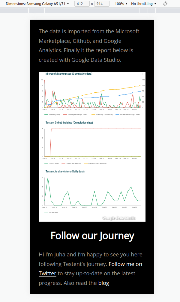
The data from Microsoft Marketplace and Github is stored in a Google Sheets speadsheet. We linked the spread sheet and Google Analytics to Google Data Studio where we created a dashboard with metrics to track. Data Studio allows embedding the report inside an iframe.
WordPress code block (not responsive)
In WordPress you embed an iframe to your page with a code block. The below HTML code is for embedding Google Data Studio dashboard to our page. The iframe works well inside the code block but it is not responsive as you can see in the image below.
<iframe
width="760"
height="1050"
src="https://datastudio.google.com/embed/reporting/98c3ebd2-8d09-4888-acae-fb19ab25c752/page/1M"
frameborder="0"
style="border:0"
allowfullscreen>
</iframe>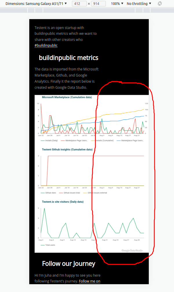
Making iframe responsive in WordPress without plugins
I found a good tutorials on how to make the iframe responsive here. You need some custom CSS and to have your iframe wrapped with a HTML div.
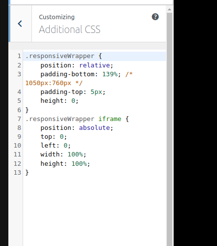
The “padding-bottom” has a value 139% which comes with the following formula:
iframe-content-height / iframe-content-width = 1050/760 = 138,15 -> 139%
We set the dashboard to be 1050 pixels in height and 760 pixels in width. The iframe content’s width (760 px) is the same as the content width of our WordPress theme (760 px as well).
.responsiveWrapper {
position: relative;
padding-bottom: 139%; /* 1050px/760px */
padding-top: 5px;
height: 0;
}
.responsiveWrapper iframe {
position: absolute;
top: 0;
left: 0;
width: 100%;
height: 100%;
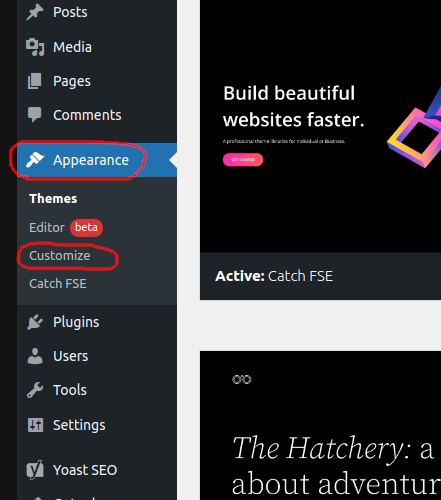
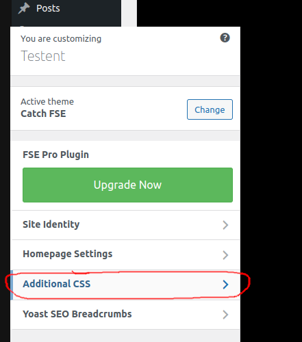
}Add the above CSS to your theme’s additional CSS. Appearance -> Customize -> Additional CSS
Use the following HTML in your code block to make the iframe finally responsive without a plugin.
<div class="responsiveWrapper">
<!-- -- responsiveWrapper class defined in "Additional CSS" of the theme customization options ---->

<iframe
src="https://datastudio.google.com/embed/reporting/98c3ebd2-8d09-4888-acae-fb19ab25c752/page/1M"
frameborder="0"
allowfullscreen=""
>
</iframe>
</div>
One more thing! Put the code block inside a group block. This at least fixed an issue on our page which caused the desktop site’s iframe to be a bit too tall.